Heading

Friday, July 31, 2015

Drawing backgrounds with powerpoint.

Elephant in Winter
 I'm frustrated drawing in photoshop. I can't manipulate shapes and my color, pattern and texture choices are very limited.

So I experimented by drawing backgrounds in powerpoint.


I like the Elephant in Winter better than the Alligator's Car Ride because I didn't use a black line in the background of the Elephant image. Wondering if I should take away the black lines entirely. Will have to give it a try.

Alligator's Car Ride

Sunday, July 26, 2015

Her Majesty Edited in Photoshop

Finished Image
I was curious to see what a drawing of mine would look like superimposed on a photographic background. I imported my digitized drawing into photoshop and erased the background. Then I selected a throne room image from the internet edited it to black and white and combined the two. Here are the results. What do you think?
Throne Room from the internet

My drawing erased background

Tuesday, July 21, 2015

Using photographs as backgrounds.

Here are a few of my experiments using photographs as backgrounds. I dropped color into the images, erased the background of the images, then superimposed them over altered photos in powerpoint. From powerpoint they were saved as jpg's.


TEARFUL. Above are the two images I merged to make the image below. Apparently there is a way to do layers in Photoshop, I just haven't learned how yet.


Here are a few other similar experiments using my photos and ones from the internet.


FEELING MEAN.
Not sure where the brown on the back of his pants come from. UGH.
SORROW.
 The gray background was appropriate for this image.
STARFISH BOY: I actually like this one best. The boy was a pretty sketchy image. I like the feel of him and the bright fresh colors.

GIVE: Below: Using our studio as a background. I wish I would not have added the foreground layer so soon. Live and learn.

And one more: IN THE AIR

Coloring In my latest drawings

I've been drawing mainly Elephants for the daily Doodle Day posts. With broad black outlines. It was a cinch to color them in with photoshop. Here are my before and afters.


 Temper. I dropped color in using photoshop. Erased the background. Created the background in powerpoint, then added the colored elephant image. I think the values are all too similar. Might have been more effective if elephant had been something like a lighter red-violet. I'll have to try that.


Bear sewing was actually a drawing from a few months ago. The original was very detailed which made dropping color in tedious. Lesson learned, keep the patterns big if I plan to use photoshop to color them in.

I really like this drawing. Coloring it with photoshop was ok but I'm noticing the more you click to change colors, the more detail is absorbed and lost. 


Dazzle [left] and Discovery [below] were two of the most successful using drop in colors and not much else. I'm getting the message here that perhaps simpler is better for straight drop in colors.

Friday, July 17, 2015

Discovering Photoshop.


I've put off purchasing photoshop because I couldn't really afford it. BUT I saved my money, got a couple of part time gigs and now am on board. I wanted to be able to digitally edit my line drawings, drop in colors and paint backgrounds or whatever. So far, I've only learned the bucket and limited  paint brush applications. BUT I'm SO excited to learn more. Here are my first attempts.


Wednesday, July 1, 2015

For Will Terry's SVS Illustration Challenge

Thumbnails: Exploring the possibilities.
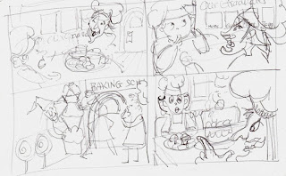
The prompt was: "Amanda was excited to go to the cottage until...." My first instinct was to do something with the candy cottage from Hansel and Gretel. Also wanted to use the witch.

Step 1: Quick sketching the thumbnails of my idea, a candy cottage with a scarey witch and Amanda, who just realizes what she's gotten herself into.


Step 2: Enlarging the idea, expanding on the concept, a baking school, pictures on the wall of former students, including Hansel and Gretel.


Step 3: Refining the characters of Amanda and the witch.


Step 4: The line version of the composition.


 Step 5: A colored pencil version. Not happy with the lettering, texture or table top perspective.


 Step 6: The final in opaque watercolors. 


NOTE: After I posted for Will's School for Visual Storytelling, I also posted on the facebook page PB Illustrator's critique group and got the following wonderful advice: from Kim MacPherson "Nice concept! I don't know where you want the viewer's eyes to go first but I see Amanda, then the witch, then the portraits. But I think different viewers will see this different wants because the values across the whole piece are very similar. Try squinting your eyes or holding this off at a distance or scanning and changing to grayscale and you'll see what I mean. I would make Amanda pop more by making her colors have a distinctive value... And maybe tone down the colors on the tablecloth and candy and other areas... Just focus in on her, he witch and the portraits... Everything else is important, but background so maybe use less color and toned down in those "supporting player" areas... Otherwise it comes across as a bit busy. But it's still cute!" 

Next on my agenda? Back to the studio to work on Kim's suggestions. Thanks again Kim!


June '15: Doodle Day Hand Lettering

I hadn't done any hand lettering to speak of since my teaching days. These were for the facebook page, Doodle Day. I pretty much chose my own words for this month. It was fun. I'm feeling more confident about hand lettering after this month.